First Draft
Problem: While this draft had the right font design of the name, the actual logo design altogether was lacking. It would be difficult to tell that it was truly a solar panel company, due to the solar panel not actually appearing as a solar panel. It needed more detail.
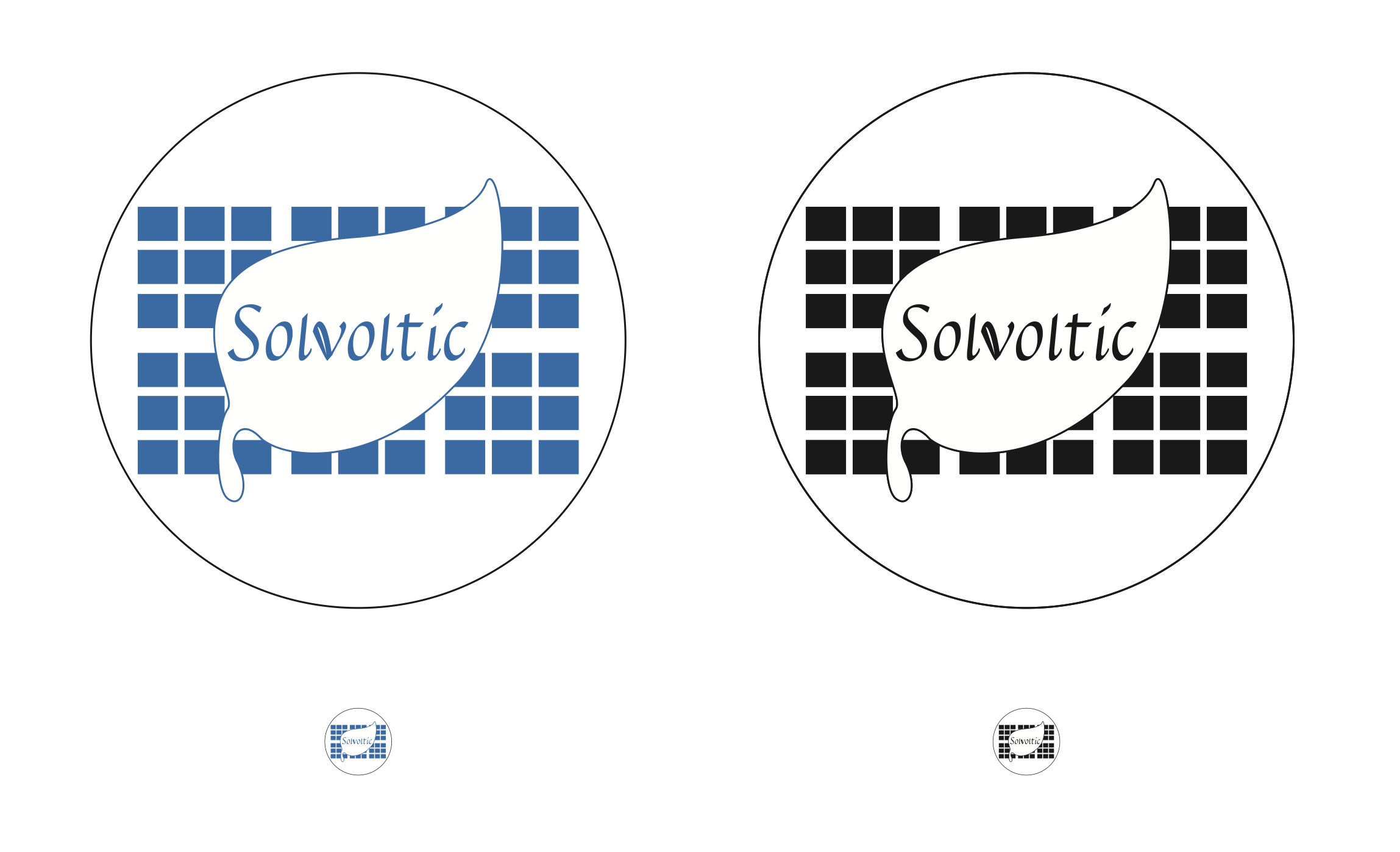
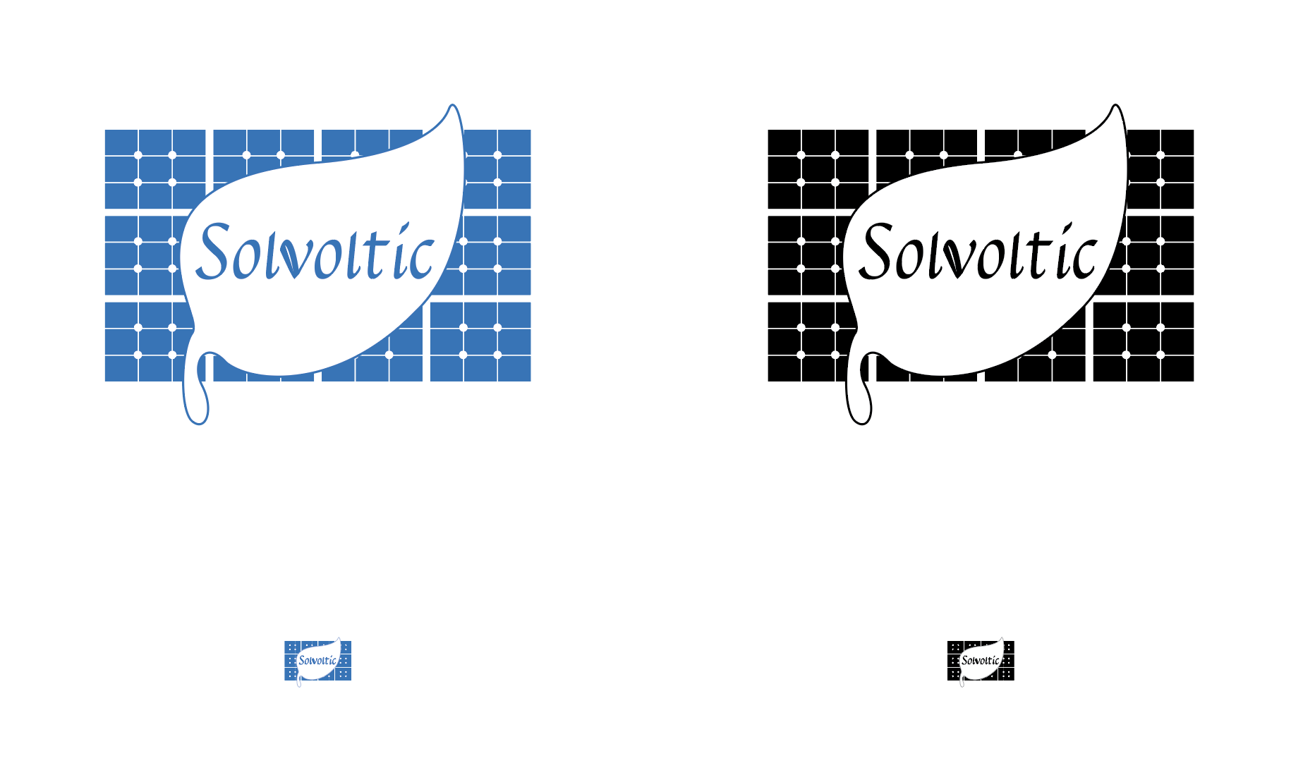
Final Design
This final design of Solvoltic has more detail to it that completes the logo entirely. The unique font design stands out and is complemented with its design elements. Potential users will be able to identify the type of company this is, while also being fully aware that this is an eco-friendly company when they idenify the leaf. The text itself also stands out on its own.