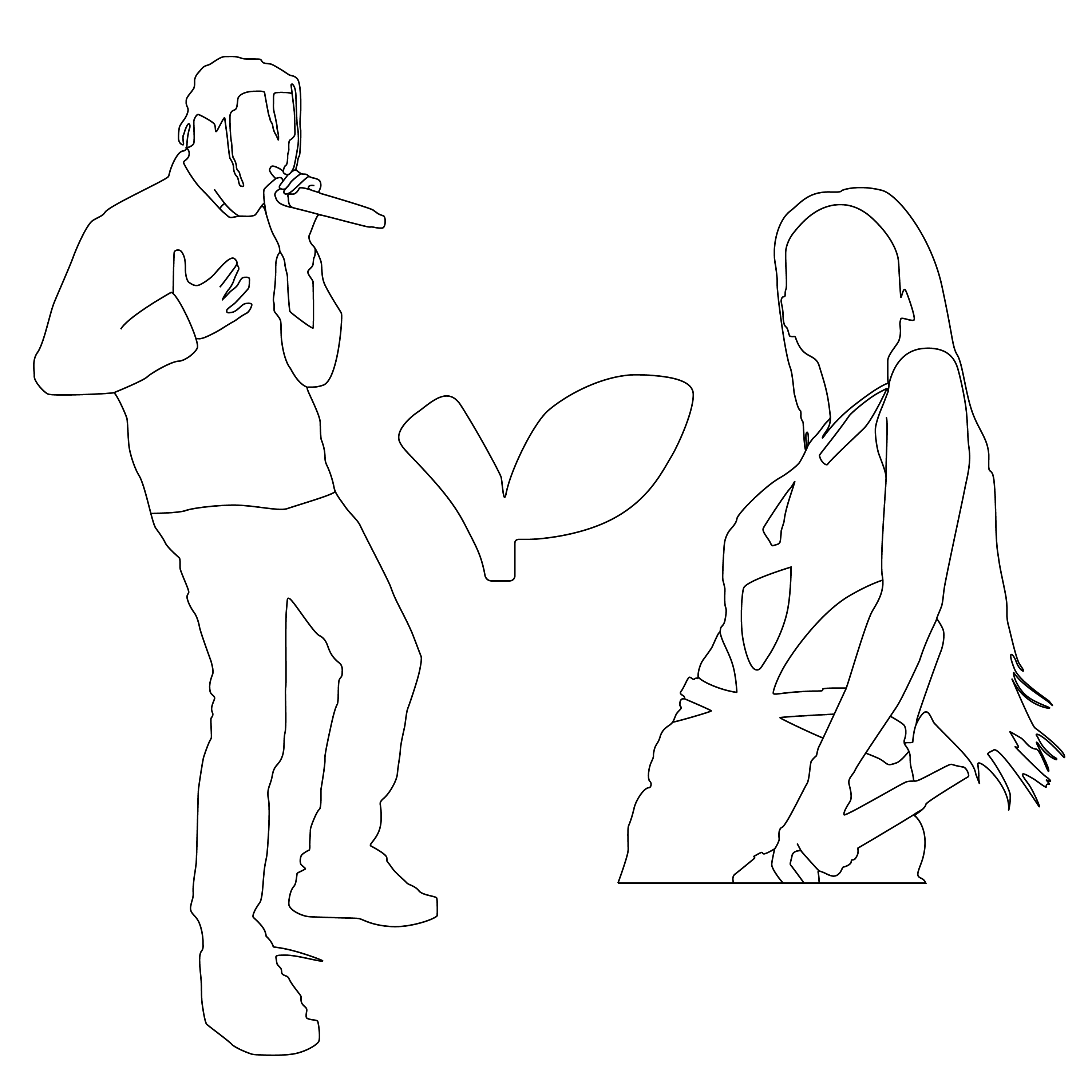
logo

Govball Posters

[2026]
Poster Design, Advertising Design

The Governors ball, or known as GovBall, is a major annual three-day, multi-genre music festival held in New York City.

These poster designs are to advertise one of the days for GovBall's 2026 festival, as a hypothetical redesign of GovBall's current poster advertisments. The posters adhere to match the branding of GovBall, while also conveying fun vibrant colors to quickly grab the attention to targetted audience and bring excitement to artists. The typography consists of exciting headers and sans-serif body fonts to ensure the readability of artists and important information.

Vertical Poster

Horizontal Poster

Poster Identity

Color Palette

Typography

<-- Portfolio

The Process

Ideation

GovBall's logo and color palette
GovBall uses a wide usage of colorful gradients in their logo and text usage on their website. This use of color keeps their brand vibrant and exciting for their events.

Potential Audience:
❖ People excited for famous featured artists
❖ Music festival enjoyers

Referencing GovBall's advertising materials
GovBall advertises their list of artists in a hierchy. Their most famous and anticipated artists are bold and in a larger font. Their secondary artists are still visible but in a noticably smaller font, and the rest of their artists are in slightly smaller fonts as well. GovBall prioritizes their most anticipated artists for each day, taking full advantage for their anticipation at GovBall.

Utilizing GovBall's advertising strategy for their artists and colorful gradients, the posters need to effectively reflect the brand of GovBall and highlight the most anticipated artists for the event. They must also be eyecatching and readable for people passing by and observing the posters.

Initial Drafts

Graphics

To properly highlight the most anticipated artists, I traced the silhouettes of these artists on illustrator to place on the poster. With these graphics, the artists are easily noticable on the posters. I also traced the leaf part of the GovBall logo to use on one of the posters.

Horizontal Poster: First Draft

This version of the Horizontal Poster needed a lot of small changes. The logo was out of place on the poster, and the hierarchy of the date and location needed fixing. The names of the artists also needed to be stylized overall.

Vertical Poster: First Draft

This version of the Vertical Poster wasn't stylized enough to properly grab the attention of the targetted audience. The hierarchy of the poster needed fixing, and the artists needed to stand out more on the poster.
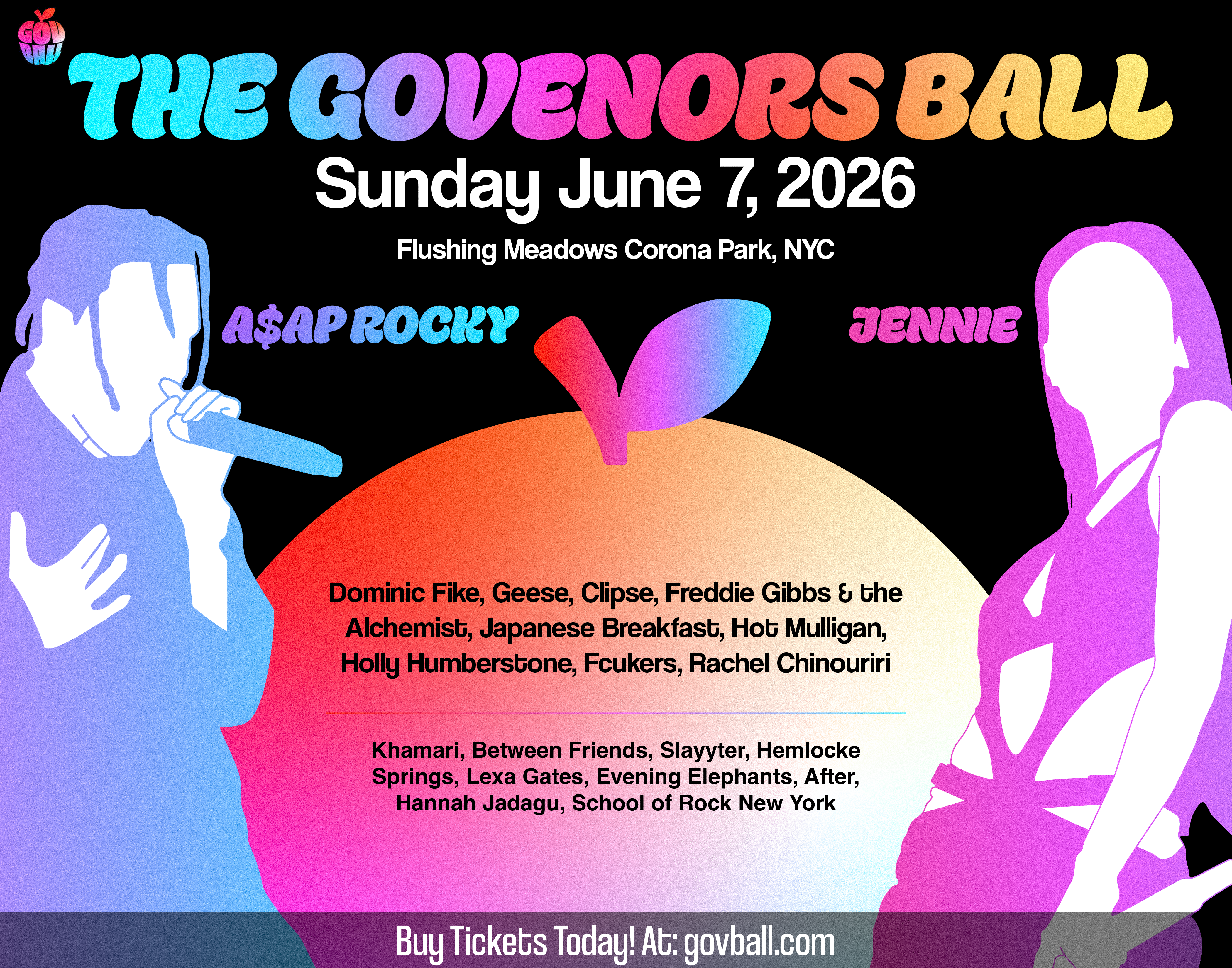
Final Drafts

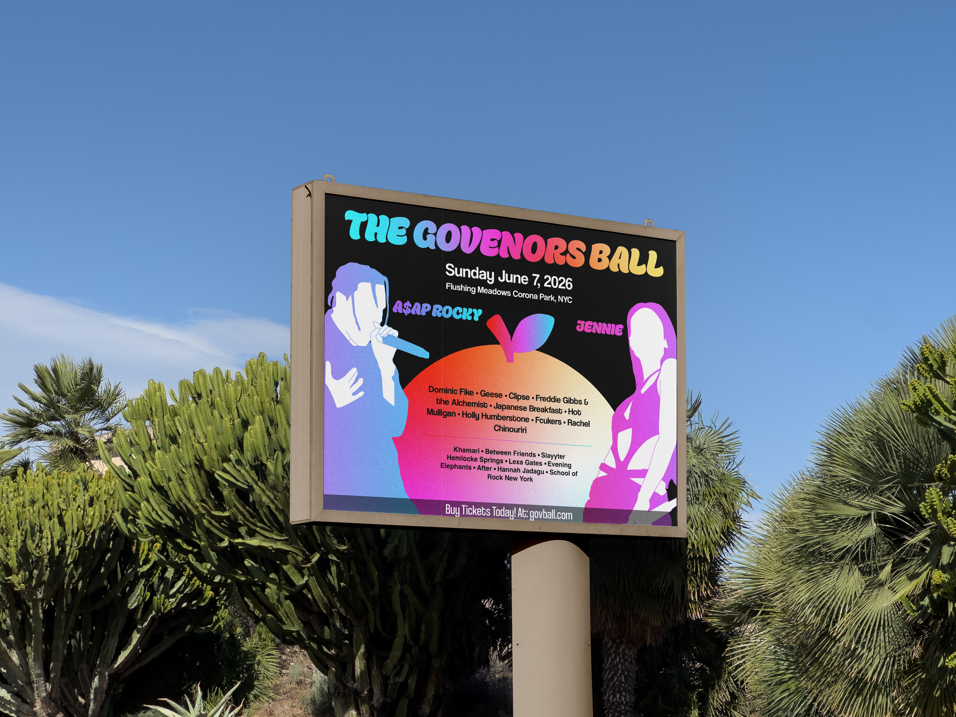
Horizontal Poster: Final Draft

The hierarchy of the Horizontal Poster was improved from the previous draft, and the names of the artists have been stylized to look better on the poster. The poster is now much more balanced, and the artists are now easily readable.

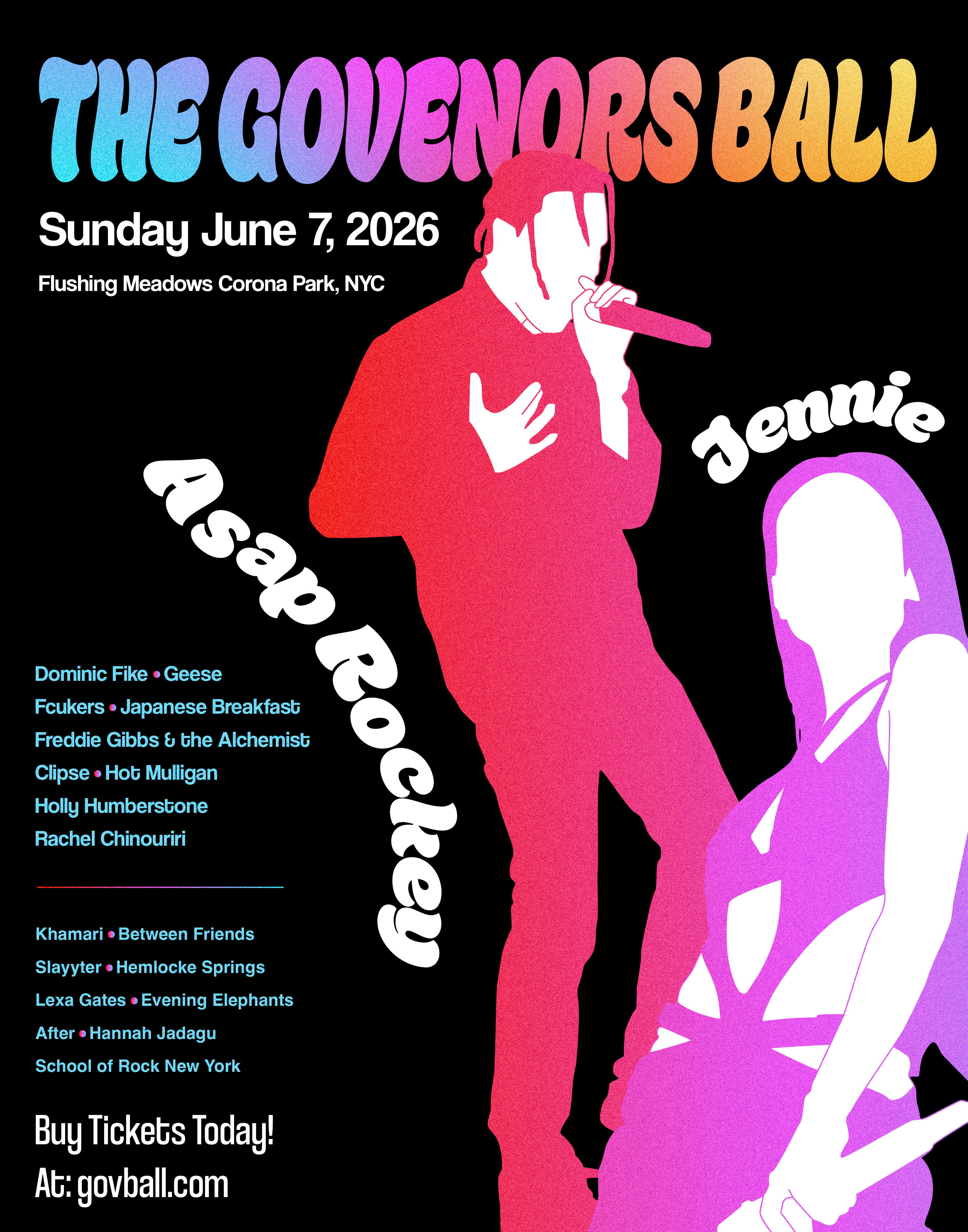
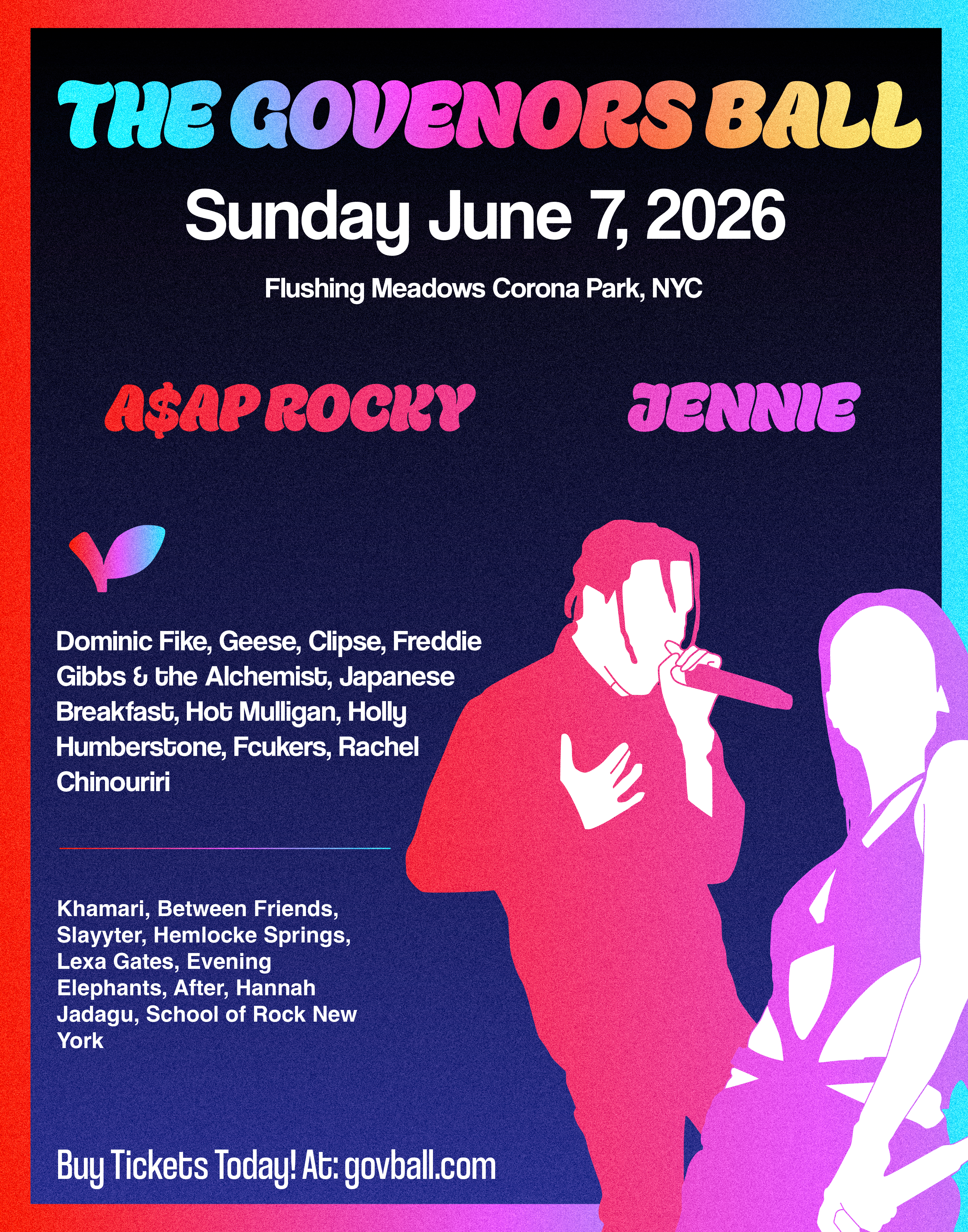
Vertical Poster: Final Draft

The final draft of the Vertical Poster is now an improved and stylized design poster overall. The hierarchy of the poster is better established, and the names of the artists were placed intentionally for the reader to gradually read every part of the poster. The artists stand out properly as the eye catcher for the poster, fully utilizing their anticipation for the event.